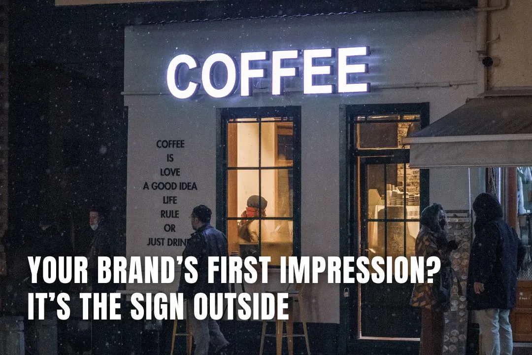
Your Brand’s First Impression? It’s the Sign Outside
May 2, 2025
How many people have walked straight past your business because your sign didn’t grab them?
It’s a tough question. But one worth asking. Because your signage isn’t just a nice extra; it’s a make-or-break part of how people perceive your business before they even step through the door.
We’ve all done it. Judged a place from the outside. Noticed a tired old sign and assumed the service inside matched. Or walked into a shop just because the signage felt fresh, sharp and inviting.
This isn’t about vanity. It’s about trust, attention and credibility.
Key Takeaways on Signages as Your Brand’s First Impression
- Signage sets the tone: The sign outside your business shapes first impressions and can directly impact whether people walk in or walk past.
- Visual cues speak volumes: Details like layout, font, and colors subtly communicate your brand's personality and professionalism.
- Quality builds credibility: Worn, outdated signs suggest neglect, while fresh, intentional signage conveys care and quality.
- Common mistakes repel customers: Cluttered layouts, poor contrast, tiny fonts, and generic designs all make signs harder to read and easier to ignore.
- Design isn't just aesthetic: Elements like font choice, spacing, and materials signal deeper messages about your business values.
- Invest in your physical presence: Businesses often focus on digital branding but overlook the high-traffic visibility of physical signage Perth.
- Plan before you update: Consider visibility, materials, placement, and tone. Test your sign’s impact with fresh eyes before making final decisions.
- Consistency builds trust: Aligning your signage with your overall brand tone and visual identity helps reinforce recognition and reliability.
Register Your LLC
Company Registration
START NOWWhy your signage matters more than most people think
The sign outside your business is often the first thing people see. And first impressions? They stick. Whether someone is walking by on foot or scrolling Google Street View from their phone, that sign is speaking on your behalf. Loudly. Great signage Perth does three things right away:
- Gets noticed – In a sea of storefronts, it grabs attention without shouting.
- Says what you do – Clear, simple messaging lets people know if you’re what they’re looking for.
- Reflects your vibe – The style, font, colours and layout all hint at your personality and professionalism.
Done well, it pulls people in. Done poorly, it sends them looking elsewhere.
What’s your signage really saying?
It’s easy to overlook. You walk past it every day. But pause and ask: if someone saw your sign for the first time, what impression would they take away?
Ask yourself a few honest questions:
Is it clean and in good condition?
Is it readable from a distance?
Does it look current or outdated?
Is the tone consistent with your brand?
Would you walk in if you saw it for the first time?
If the answers aren’t clear or positive, there’s a problem worth fixing.
The silent power of design
Even if someone doesn’t read every word, they’re picking up a lot just from the design. People form opinions in seconds, sometimes even before they’ve fully registered the name on the sign.
Details like spacing, alignment, font choice and colours all send subtle signals. Cheap materials or poorly applied vinyl can give the impression of rushed work or lack of care. And that translates, consciously or not, into how people expect to be treated as customers.
You might have the best product or service around. But if your sign doesn’t reflect that quality, it creates a mismatch that can put people off before you get the chance to prove yourself.
Common mistakes that cost businesses walk-ins
Let’s look at a few of the repeat offenders when it comes to signage that turns people away.
- Too cluttered – A sign overloaded with text, logos or colours can be confusing and hard to take in. People need clarity, fast.
- Low contrast – Light-coloured text on a light background (or dark on dark) often looks nice up close but is unreadable from the street.
- Tiny text – If your key message can’t be read from a few metres away, it’s not doing its job.
- Old and worn out – Faded, cracked or peeling signs don’t give off an impression of quality or attention to detail.
- No clear identity – Generic fonts and layouts make it easy to blend in with every other business nearby. And that’s the last thing you want.
The case for updating your sign
Think about how much time and money businesses spend on digital presence — social media, websites, email campaigns. All good things. But what about the sign that thousands of real people walk or drive past every week?
Updating your signage is one of the simplest, most cost-effective ways to instantly lift how your brand is perceived. It doesn’t need to be flashy or trendy. Just clean, clear and aligned with your brand’s tone and values.
If your brand is minimalist and modern, your sign should reflect that. If it’s warm and welcoming, the typography and colours should match. Consistency builds trust.
What to consider before you make changes
If you're thinking about updating your signage, don’t rush in without a plan. Take time to map out what your brand actually stands for and how you want to be seen.
Start with the basics:
- Visibility – Will people spot it easily as they pass by? Are the colours and fonts legible?
- Placement – Is the sign in the right location, at the right height, facing the right direction?
- Materials – Think about durability as well as appearance. Will it hold up in all weather?
- Tone of voice – What does the wording (if any) sound like? Does it speak in the same tone as the rest of your brand?
- Compliance – Always check local council rules or building restrictions before you install or change signage.
And crucially, make sure you’re not relying on your own opinion alone. Get a few other sets of eyes on it, ideally from people who don’t already know your business. Their gut reactions will tell you more than a dozen design meetings ever could.
This isn’t just about aesthetics
It’s about perception, trust, and making people feel like your business is worth their time. The outside of your business sets the tone for everything inside. If the sign makes someone pause, feel curious, or sense quality, you’re already halfway to earning their business.
Great signage isn’t loud. It doesn’t need to be flashy. But it should be intentional. Strategic. And designed to make someone stop, look twice, and think, this place looks good.
Worth a closer look?
If it’s been a while since you gave your signage a proper look, not a passing glance, but a real, honest assessment, now might be the time. It’s not just a board with your name on it. It’s a silent salesperson working 24/7, speaking volumes about who you are before anyone speaks to you. Make sure it’s saying the right things.
FAQs for Your Brand’s First Impression? It’s the Sign Outside
Why is my physical sign so important in a digital world?
Even with a strong online presence, your physical sign is a 24/7 advertisement to local foot and road traffic. It’s often the first impression people have of your business in the real world, directly influencing their decision to step inside.
What are the most common mistakes to avoid with business signs?
Many businesses create signs that are too cluttered with information, use colours with low contrast that are hard to read from a distance, or choose text that is too small. A worn, faded, or damaged sign also sends a negative message about your attention to detail.
How can I tell if my current sign is hurting my business?
Take a step back and look at your sign with fresh eyes. Ask yourself: Is it clean and easy to read? Does it look dated? Does it accurately reflect the quality of service you provide inside? If the answers are no, it might be turning potential customers away.
What should I think about before designing a new sign?
Consider its visibility from different angles and distances, the durability of the materials, and its placement for maximum impact. Most importantly, ensure the design's tone, colours, and fonts are consistent with your overall brand identity, something platforms like Storific can help you define.
Does the material of my sign really matter?
Yes, it does. The material affects not only the sign's durability against weather but also the perception of your brand. High-quality materials can suggest a high-quality business, while cheap or worn materials can imply a lack of care.