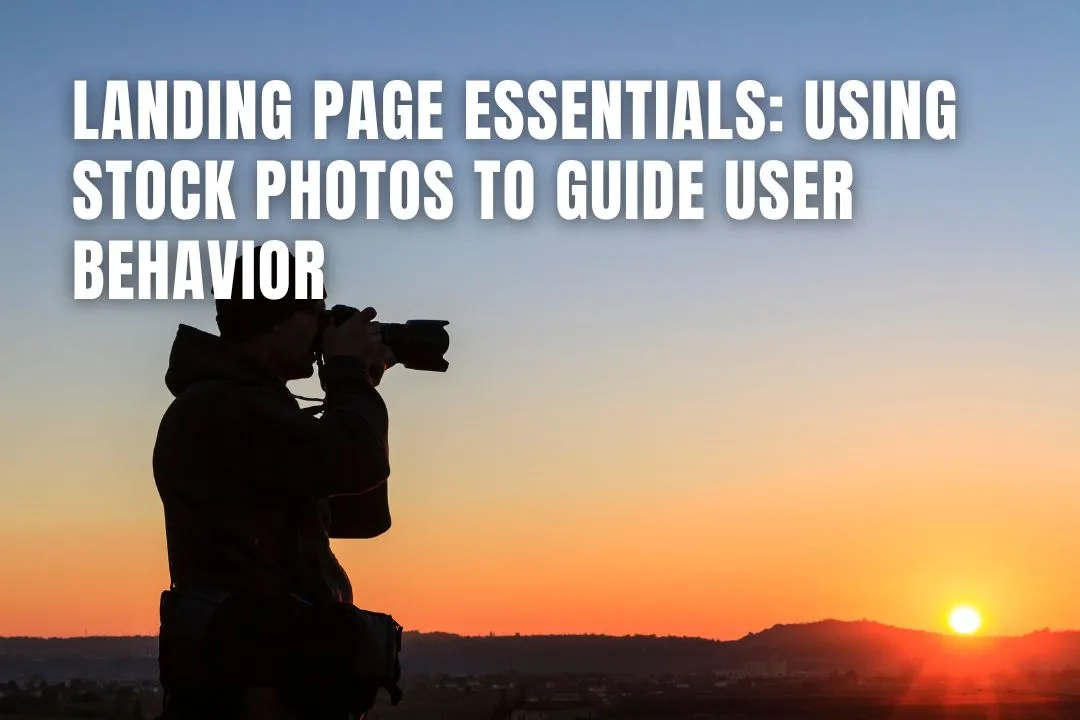
Landing Page Essentials: Using Stock Photos to Guide User Behavior
August 8, 2025
You know, landing pages are kind of a big deal for getting people to do stuff online, like buy something or sign up. And a lot of that comes down to how they look. We're talking about images here. It’s not just about making things pretty, though. The pictures you use, especially stock photos, can actually steer people where you want them to go on the page. It's like a visual roadmap. Let's talk about how to get it right.
Key Takeaways: Using Stock Photos to Optimise Landing Page Behaviour
- Visuals guide user actions: Stock photos aren't just decorative, they influence attention, trust, and conversions by directing users where to focus.
- Purpose-driven imagery: Every image must support the page's objective, whether it's explaining, illustrating, or building trust around your product or service.
- Prioritise quality and relevance: Avoid generic, blurry, or mismatched stock photos. High-quality, relatable visuals aligned with your audience improve credibility.
- Strategic image placement: Placing images near CTAs, benefits, or user journey sections can lead the eye and increase engagement and conversion rates.
- Avoid inauthentic visuals: Overused or staged images damage brand credibility. Opt for visuals that feel natural, relatable, and brand-appropriate.
- Enhance clarity with icons and graphics: Icons simplify complex concepts and highlight features, helping users absorb information faster.
- Optimise for speed and performance: Compress images, choose the right formats (e.g. JPEG, PNG, SVG), and enable lazy loading to reduce bounce rates.
- Use personal and customer photos: Authentic founder images and UGC boost trust and humanise your brand, especially on high-intent pages.
- Showcase real-world applications: Demonstrating how products or services work in real scenarios makes the value proposition more tangible and convincing.
- Continuously test and improve: A/B test image placement, monitor behaviour via heatmaps, and refine visuals regularly to boost conversion performance.
Register Your LLC
Company Registration
START NOWLeveraging Stock Photos for Landing Page Impact
When you're putting together a landing page, visuals are a big deal. They're not just there to look pretty; they actually do a lot of work to get people to pay attention and do what you want them to do. Think about it – we process images way faster than text. So, getting your visuals right is pretty important if you want your page to actually work.
Understanding the Purpose of Your Visuals
Before you even start looking for pictures, you need to know why you're putting them on the page. Are they supposed to explain what you're selling? Show how something works? Or maybe just make the page look more interesting? Knowing the goal helps you pick the right kind of image. If you're selling a product, you'll want clear photos of it, maybe even showing it in use. If it's a service, you might need graphics that explain the process. The image needs to do more than just fill space; it needs to help your message.
Choosing Relevant and High-Quality Stock Photos
This is where you have to be a bit picky. The photos you pick need to actually match what you're talking about and fit with your brand's overall feel. Generic, cheesy stock photos that don't seem to fit can actually hurt your page more than help. Look for pictures that are clear, well-lit, and just look good. Blurry or pixelated images make your whole page look less professional. It's also smart to think about who you're trying to reach. Does the image feel like it speaks to them? Using visuals that your audience can relate to can make a big difference.
The Power of Visual Communication
Images have this amazing ability to grab someone's attention right away. They can communicate ideas quickly and even make people feel something. A good picture can make your offer clearer, show off your product in the best light, and help build trust. Plus, they can guide people's eyes around the page, pointing them towards important things like a button to click or a key piece of information. It's like having a silent salesperson working for you.
The right visuals can make your landing page much more effective. They help people understand what you're offering and encourage them to take the next step. It's all about making a connection and making things easy for the visitor.
Here's a quick look at what makes visuals work:
- Relevance: Does the image relate to your content?
- Quality: Is the image clear and professional?
- Audience Fit: Will your target audience connect with it?
- Purpose: Does it support your page's goal?
Strategic Placement of Stock Photos
Where you put your pictures really matters on a landing page. It’s not just about making things look pretty; it’s about guiding people to do what you want them to do. Think of it like setting up a path for someone to follow. The right placement can make all the difference in whether someone sticks around or clicks away.
Creating Focal Points with Images
Your main image, often called a hero image, should be the first thing people see. It needs to grab attention right away and tell them what your page is about. Placing this image prominently, usually at the top of the page, creates an immediate focal point. This helps visitors understand your core message instantly. Other images can be used to draw attention to specific features or benefits you're highlighting. It’s like using a spotlight to show off the most important parts of your offer.
Guiding User Flow Across the Page
Images can act as visual signposts, leading visitors through your content. You can use the direction a person is looking in a photo, or the way an element is arranged, to subtly point towards the next section or a call-to-action button. For instance, an image of someone looking towards a "Learn More" button naturally draws the viewer's eye in that direction. This creates a smooth journey for the user, making it easier for them to find what they need and take the next step.
Highlighting Key Information and CTAs
Sometimes, you need to make sure a specific piece of information or a button really stands out. Images are great for this. You can place a relevant image right next to a key benefit to make it more memorable. For call-to-action (CTA) buttons, you can use images that visually frame the button or use directional cues to point directly at it. This makes the CTA harder to miss and more inviting to click. It’s about making sure the most important actions are clear and easy to find.
Avoiding Pitfalls with Stock Photos
Using stock photos can be a real lifesaver when you need visuals fast, but it's also super easy to mess it up. You know, those cheesy, overused pictures that everyone and their dog has seen a million times? Yeah, those. They can totally kill your landing page's vibe and make people think you're not serious about your business.
Steering Clear of Fake or Overused Stock Photos
Seriously, nobody wants to see another picture of a group of people in a circle, all smiling way too hard at a laptop. It just screams 'fake.' The same goes for those generic handshake photos or people pointing at charts that don't mean anything. These images have been done to death, and they make your brand look unoriginal and, frankly, a bit lazy. It’s like showing up to a party in the same outfit as three other people – awkward and forgettable.
Maintaining Authenticity and Credibility
Your landing page is where you make a first impression, and if that impression is built on tired, fake-looking stock photos, you're already losing. People want to see realness. They want to trust you. Using visuals that feel staged or overly polished can make visitors question if you're being upfront about what you offer. It’s better to have a slightly less perfect, but genuine, image than a super slick one that feels completely made up. Think about it: would you buy from someone who looks like they're posing for a magazine cover, or someone who looks like they actually use and believe in their product?
The Impact of Inauthentic Imagery
When your images don't feel real, it creates a disconnect. Users might not be able to pinpoint exactly why, but they'll feel something's off. This can lead to them bouncing off your page before they even read your headline. It’s a subtle thing, but inauthentic imagery can really hurt your conversion rates because it erodes trust. If the pictures look like they were pulled from a generic library, why should someone trust your business with their money or their information? It’s a missed opportunity to connect and build that all-important rapport.
Enhancing Messaging with Visuals
Visuals aren't just about making your landing page look pretty; they're powerful tools for getting your message across. Think of them as your silent salespeople, working hard to explain what you offer and why someone should care. When you use graphics and icons, you're essentially giving your visitors a shortcut to understanding. Instead of reading through a block of text, a well-placed icon can instantly communicate an idea or a benefit. For instance, using a checkmark icon next to a list of features makes those benefits pop and feel more concrete. It's about making information digestible and memorable.
Illustrating complex concepts visually is another big win. If your product or service involves a process or a system that's a bit tricky to explain in words alone, a simple diagram or infographic can clear things up fast. This not only helps people understand what you're offering but also shows you've put thought into making it easy for them. It builds confidence because it shows you're not hiding anything behind confusing language. This clarity can be the difference between a visitor understanding your value and bouncing off your page.
Creating a cohesive brand experience means everything on your page works together, and your visuals are a huge part of that. When your graphics, icons, and even the style of your photos all match your brand's personality and colors, it feels professional and trustworthy. It's like wearing a uniform – it signals you're part of a team and you know what you're doing. This consistency helps people remember you and feel more connected to what you're offering. It’s about making sure every element on the page supports the overall message and feeling you want to convey, making your landing page more effective overall. You can find great resources for icons and graphics to help with this, making your message clearer and more impactful.
Optimizing Stock Photos for Performance
Making sure your landing page loads fast is a big deal. Nobody likes waiting around for a page to load, right? Slow pages can really turn people off, and they might just leave before they even see what you're offering. So, while pretty pictures are great, they also need to play nice with your page's speed.
Balancing Image Quality and Loading Speed
It’s a bit of a balancing act. You want images that look good – sharp, clear, and professional. But big, high-resolution files can really bog down your page. The trick is to find that sweet spot. You can use tools to compress your images, which shrinks the file size without making them look all fuzzy or pixelated. Think of it like packing a suitcase; you want to fit everything in without it bursting open. Getting this right means users have a better experience and are more likely to stick around.
Selecting Appropriate Image Formats
Different types of images work best with different file formats. For photos, JPEG is usually the way to go because it handles lots of colors well and keeps file sizes down. If you have graphics with transparent backgrounds, like logos or icons, PNG is your best bet. For simple graphics and logos that need to scale without losing quality, SVG is a good choice. Using the right format helps keep those file sizes manageable, which directly impacts how quickly your page loads. It’s a small detail, but it adds up.
The Importance of Image Optimization
Beyond just choosing the right format and compressing them, there are other ways to optimize. Things like lazy loading, where images only load as the user scrolls down the page, can make a huge difference in initial load times. Also, making sure your images are responsive means they'll automatically adjust to fit different screen sizes, whether someone's on a desktop or a phone. This makes sure the image looks good and loads efficiently everywhere. We want to make sure our landing page looks good and works well for everyone, no matter what device they're using. You can find some great tips on how to optimize your images for better landing page performance.
Slow loading times are a major turn-off for website visitors. Prioritizing image optimization is key to keeping users engaged and preventing them from bouncing off your page before they even see your main content or call to action.
Building Trust with Authentic Imagery

The Role of Personal Photos and Founder Images
People connect with people, not just logos. Showing the faces behind your business, especially your own as a founder, can make a huge difference in building trust. It humanizes your brand and makes it feel more approachable. Think about putting a friendly photo of yourself, maybe in your workspace or during a typical workday, near your 'About Us' section or even in the header. This personal touch helps visitors feel like they're dealing with real individuals who care about their product or service. It’s a simple way to make your landing page feel less like a faceless corporation and more like a genuine interaction. For instance, if you're a consultant, a picture of you speaking or working with a client can be very effective. It shows you in action and builds confidence.
Leveraging User-Generated Content
What's more convincing than a happy customer? User-generated content (UGC), especially photos from your actual customers using your product or service, is gold. It acts as powerful social proof. When potential customers see real people enjoying what you offer, they're more likely to trust it themselves. Encourage your customers to share their experiences by posting photos on social media with a specific hashtag. Then, with their permission, feature some of the best ones on your landing page. This not only adds authenticity but also shows your product in real-world settings, which is often more compelling than staged professional shots. It’s a great way to diversify your visuals and keep your page looking fresh.
Showcasing Real-World Applications
Beyond just showing people, demonstrate how your product or service is used in everyday life. If you sell a physical product, show it being used by different types of people in various situations. For a service, perhaps show a before-and-after scenario or a client achieving a positive outcome. These visuals help potential customers imagine themselves benefiting from what you offer. They answer the unspoken question: "How will this help me?" by providing visual answers. This kind of imagery makes the benefits tangible and relatable, moving beyond abstract claims to concrete examples. It’s about painting a picture of success for your visitor, making your offering feel more practical and desirable. For more on creating effective landing pages, check out landing page design.
Testing and Refining Your Visual Strategy
So, you've put together a landing page, picked out some decent stock photos, and you're feeling pretty good about it. But how do you really know if it's working? That's where testing and refining come in. It’s not enough to just guess; you need to see what your actual visitors are doing.
Conducting Visual Layout and Placement Tests
Think of your landing page like a stage. Where you put the spotlight (your images) makes a huge difference in what the audience sees first. You can try different arrangements – maybe a big hero image at the top, or smaller, supporting images scattered throughout. A/B testing is your best friend here. You create two versions of your page, each with a different image setup, and see which one gets more people to take the action you want. It’s like trying out different window displays to see which one draws more shoppers in. You can use tools to track things like how long people stay on the page or where they click.
Analyzing User Behavior for Insights
Once you've got your tests running, you need to actually look at the data. What are people clicking on? Where are they dropping off? Heatmaps are super useful for this; they show you a visual representation of where users are spending their time and clicking the most. If a key image isn't getting any attention, maybe it's in the wrong spot or just not interesting enough. Understanding this behavior helps you figure out why a certain layout is performing better than another. It’s about getting a feel for what actually connects with your audience, not just what you think will connect. You can discover a lot about user interaction on your site by analyzing user behavior.
Continuous Improvement of Visual Elements
This isn't a one-and-done kind of deal. The internet changes, trends shift, and your audience might evolve too. So, you need to keep an eye on your landing page's performance and be ready to tweak things. Maybe a particular stock photo starts to feel dated, or a new trend emerges that you can incorporate. Regularly reviewing your analytics and running new tests will help you stay on top of what's working. It’s a cycle: test, analyze, refine, and then test again. This ongoing process is how you make sure your landing page stays effective and keeps bringing in the results you want.
Wrapping It Up: Making Images Work for You
So, we've talked a lot about how pictures can really change how people see your landing page. It's not just about making things look pretty, though that's part of it. Using the right photos, the ones that feel real and match what you're selling, can actually guide people where you want them to go. Think about making a clear path with your images, pointing towards that 'buy now' button or signup form. And remember, nobody likes a slow website, so make sure those great pictures load fast. Keep playing around with different images and see what works best for your visitors. It’s all about making your page easy to look at and easy to use, so people actually stick around and do what you hope they’ll do.
Frequently Asked Questions
Why do I need pictures on my landing page?
Think about what you want people to do on your page. Do you want them to buy something, sign up, or learn more? Your pictures should help with that goal. If you're selling a cool gadget, show it off with awesome photos. If you offer a service, use images that explain how it works.
What kind of stock photos should I avoid?
It's super important to pick pictures that look real and fit your brand. Avoid photos that seem fake, like people smiling too much in weird poses, or pictures everyone else uses. This makes your page look more trustworthy and less like a cheesy ad.
Can pictures help guide people on my page?
Yes! Putting a great picture near the top of your page grabs attention right away. You can also use pictures to lead people's eyes down the page, kind of like a breadcrumb trail, showing them where to look next. It helps them find what's important.
How can graphics and icons help my message?
Definitely. Simple drawings, called icons, can make things easier to understand quickly. For example, a little envelope icon next to your email address tells people it's for contact. Graphics like charts can explain tricky ideas without a lot of words.
How do I make sure my pictures don't slow down my website?
Big pictures can slow down your website, which makes people leave. Try to use pictures that are good quality but not too huge. Think of it like using a clear photo that's not a giant file. Also, use the right file type, like JPG for photos and PNG for things with see-through parts.
How can I tell if my pictures are working well?
Testing is key! Try showing different pictures or putting them in different spots and see which ones get more people to do what you want. Look at how people use your page to figure out what works best. It's all about making small changes to get better results.