How Smart Product Designers Make Goods Seem More Expensive
September 15, 2025
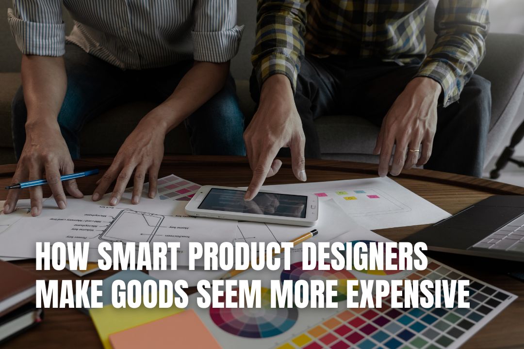
There’s an interesting truth about product design, which is that how something feels and looks in the hand can be just as important as what’s inside. People often judge quality on the smallest details without thinking about it, and don’t worry, both you and I are guilty of this. Sometimes, even the weight of a bottle, the texture of packaging, the finish of a label, or how easily a lid opens can influence how premium something feels. These aren’t conscious calculations for most buyers, but little nudges that suggest care and attention, and that fool us into gauging false (or at least exaggerated) value.
Brands that understand this can often elevate their products without overhauling them. That’s why you sometimes notice two goods with almost identical ingredients, yet one seems more high-end simply because of presentation. It’s why supermarket own-brand is generally just as good as mainline brands, but we don’t think so. The more polished and thoughtful the design, the more confidence a customer tends to have in choosing it.
Key Takeaways on Making Products Seem More Expensive
- Attention To Materials: The materials you choose, like glass over plastic or a matte finish over a glossy one, significantly influence a customer's perception of quality and value before they even use the product.
- Capable Use Of Packaging Features: Practical, well-designed features, such as a smooth trigger spray instead of a basic cap, can create a more satisfying user experience, which in turn reflects positively on the perceived quality of the brand.
- Design Consistency Across The Range: Maintaining a cohesive design language across all your products and packaging builds a professional and confident brand image, making each individual item feel more premium.
Register Your LLC
Company Registration
START NOW
How could your brand make use of this value-added approach? Let’s consider that below:
Attention To Materials
The choice of material has a strong effect on how expensive something appears. Glass feels more premium than plastic for example, and a matte finish looks more refined than glossy, and sturdy packaging often suggests durability.
We often find that customers pick up on these details quickly, which means designers who want to create a higher-end feel often spend time refining these aspects, making sure that the product looks as though it belongs in a higher price bracket. These materials do have to serve the wider branding of course, and practicality is important. There’s a reason most soda companies aren’t using glass only. But there’s also a reason why restaurants of a certain quality may still prefer to provide that glass bottle.
Capable Use Of Packaging Features
Practical features can easily influence to how luxurious a product seems on top of the packaging, or as part of it. Trigger sprays, for example, are often smoother and easier to use than basic caps, and they create a sense of control that feels satisfying and pleasant. That’s because a bottle with a sturdy, well-built spray mechanism feels like a step above something with a flimsy nozzle to have to point in the right way to work.
If customers associate a new smooth experience with your higher quality, it helps to reflects back on the brand as a whole.
Design Consistency Across The Range
When products look like they belong together, the effect is often powerful. A consistent design language across labels, bottles, and packaging sizes creates a sense of cohesion, and that cohesion reads as professionalism from a confident brand comfortable in its identity.
People are more likely to perceive the brand as well-organised and therefore more premium if you do this right. The opposite is true too, as mismatched packaging can make products feel cheaper than they are. Designers who manage to keep a consistent thread running through the entire range often end up improving the value of each individual product without changing much about what’s inside.
With this advice, we believe you’ll make your own goods seem more expensive, even if they’re great to begin with.
FAQs for How Smart Product Designers Make Goods Seem More Expensive
Why does the weight of a product influence how expensive it seems?
Heavier products often feel more substantial and durable. This physical sensation can create an unconscious association with higher quality materials and better craftsmanship, leading customers to perceive the item as more valuable, even if the internal components are identical to a lighter alternative.
Can a simple packaging feature really change customer perception?
Absolutely. A feature like a well-designed, easy-to-use spray nozzle or a satisfying magnetic closure on a box provides a smoother, more pleasant user experience. These small details suggest that the brand has invested in quality, which elevates the perceived value of the entire product.
Is it more important for a product to look good or be functional?
Both are crucial, but the initial perception is often driven by appearance. A product's design, from its materials to its packaging, is the first thing a customer interacts with. While functionality ensures long-term satisfaction, a premium look is what often convinces a customer to make the initial purchase.
How does design consistency make a brand seem more premium?
When all products in a range share a consistent visual identity, it signals professionalism and a strong brand identity. This cohesion makes the brand look well-organised and confident, which customers often interpret as a sign of higher quality and trustworthiness, thereby increasing the perceived value of each product.
Are there cost-effective ways to make my product design feel more luxurious?
Yes, you don't always need expensive materials. Focusing on details like a unique texture on your packaging, a minimalist label design, or ensuring all elements are perfectly aligned can create a high-end feel. Many resources, including insights from platforms like Storific, can guide you on making impactful changes without a huge budget.